Featured Maps: Bloopers! (1 April 2010)
Usually the Featured Maps demonstrate things you might consider doing with the Great Circle Mapper. Today is April Fool's Day, however, so these maps are ones you hopefully cannot generate with the site: these are bloopers or outtakes from when early versions of the software didn't work quite as intended. It's not quite a gag reel, but hopefully some of them will make you smile.

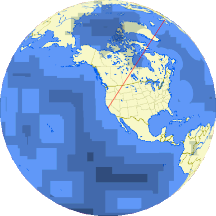
The new site includes software to generate orthographic projections from pre-rendered maps, which allows arbitrary perspectives using the Blue Marble imagery. This one was centered on London (LHR to be precise) but something went horribly wrong and the entire southern hemisphere was smeared. I like the visual effect.
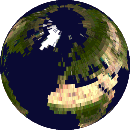
This map is another orthographic projection centered on LHR. The effect of stretching pixels into rectangular strips is interesting. The details of what went wrong have been lost to time.
This time the land masses look right, but most ETOPS ranges look like something Andy Warhol might have created.
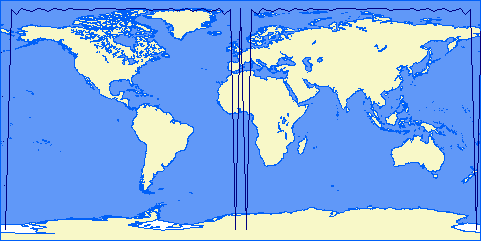
Spherical trigonometry is difficult near the poles, and even worse when using an oblate spheroid as is done in the Great Circle Mapper. The original site uses a geodesic software library which doesn't handle edge cases very well, and this map of a 12000 mile range centered on the north pole is one example of the result. The new Great Circle Mapper uses more robust mathematics which produces a map that is accurate, though rather boring.
Have fun today!
|
Information on this site may not be accurate or current and is not valid for flight planning or navigation. No warranty of fitness for any purpose is made or implied. Flight planning and navigation should only be done using official charts.
Copyright © 2010-2024
Karl L. Swartz.
All rights reserved.
|